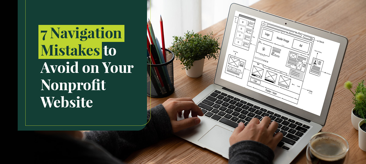
Your website’s navigation is a crucial element for creating a positive user experience. Effective navigation makes it easy for visitors to find what they’re looking for and gain the most value from your website.
But it can be easy to fall into navigation traps and missteps. Your organization could get caught up in trendy menu innovations and forget to prioritize the user experience.
You might also be interested in updating your website’s navigation if you’re in the midst of a major site shift, such as a re-brand or a migration. In this guide, we’ll highlight seven navigation mistakes to avoid and tips for designing an effective navigation strategy:
- Not aligning navigation to your user journeys
- Not prioritizing your most important pages
- Using a non-standard menu style
- Including too many menu items
- Having a poorly-labeled menu
- Not making your navigation mobile-responsive
- Not listening to your audience’s preferences
Throughout this guide, we’ll pull examples from Kanopi’s roundup of the best nonprofit websites to illustrate effective navigation design.
1. Not aligning navigation to your user journeys
Your menu items should speak to your audience’s goals to make it easier for them to browse your website.
Think about what your various audience members want to do on your site. For instance, they might be looking for opportunities to:
- Donate
- Volunteer
- Join a fundraiser
- Access your services
- Become an advocate
- Submit a matched gift
- Host an event
Your menu should include items that help each of your primary audience groups find the information they need to engage with your organization.
Consider breadcrumb navigation to help users understand where they are in their journey. For example, Habitat for Humanity’s website uses a simple breadcrumb trail to help visitors navigate back to previous pages and understand how they arrived on the current page:

The easier you make it for audiences to engage with the activities they’re interested in, the more online support you can gather for your cause.
2. Not prioritizing your most important pages
In addition to designing your menu with your main audiences in mind, you should also structure it to display your most important pages first.
Focus on the most important pages that drive results for your nonprofit. That might involve putting your “our mission” and “our strategic priorities” pages ahead of your “staff profiles” page.
You might also put your donate button in a prominent place at the top right corner of your header to make it stand out. For example, look at how the American Heart Association’s website uses large buttons and colors to make their one-time and recurring donation buttons stand out from the rest of the menu:

This helps draw visitors’ attention, especially when you use eye-catching colors that match your brand guidelines.
3. Using a non-standard menu style
Imagine you download a social media app and begin using it every day. You get used to the format and style of the app, including where the buttons are for creating a post or viewing your timeline. Then one day, you open the app and the structure is completely different. Now, the timeline button has been switched with the trending news button and the create post tab has been replaced with the profile button.
This can lead to a frustrating user experience. In some cases, it might even cause you to view the app negatively and use it less frequently. This example illustrates the importance of aligning your website’s navigation with your visitors’ expectations.
Your visitors will probably expect to see prominent pages, like your donation form and volunteer registration page, linked within your top-level menu. Maintaining this structure as much as possible during a redesign will provide a reliable user experience.
Also, even if you decide to update your menu’s structure, make sure it reflects your nonprofit’s current branding, including your logo, font, and color scheme. Maintaining consistent branding also helps align with visitors’ expectations and provides a more cohesive navigation experience.
4. Including too many menu items
According to Double the Donation’s nonprofit web design guide, minimalism is key: “[Donors] are already going out of their way to help your cause, so the last thing you want to do is scare them off with a cluttered and complex site.”
Too many subheader-menu items can become confusing and create a cluttered navigation structure. Your menu shouldn’t include more than five or six main items. For example, take a look at how the Boys & Girls Clubs of America website highlights just a few main topics in the top-level menu:

If you choose to include sub-level menu items, keep those at a minimum as well. Too much information can be overwhelming for visitors, and complex menus don’t translate well to mobile devices.
5. Having a poorly-labeled menu
Your menu items should not be ambiguous or vague. Visitors should immediately know what they can expect to see from clicking on each menu item.
Follow these tips to choose descriptive menu labels:
- Make sure each menu item is concise. Typically, they should be only around one to two words.
- Use bold action verbs. Phrases like “Donate Now”, “Volunteer”, and “Host an Event” are clear and straightforward.
- Make sure your tone matches your brand. Many nonprofit websites use phrases like “Get Involved” or “Support Us” to lead visitors to a page with multiple engagement opportunities, such as donating, volunteering, hosting a fundraising event, and more. Choose language that matches your nonprofit’s tone and aligns with how you like to describe your opportunities.
If your organization uses specific lingo or terms that aren’t widely known, avoid including this type of language within your menu and stick to well-known phrases. This helps make your menu as clear and straightforward as possible.
6. Not making your navigation mobile-responsive
Your menu should be easy to find and use on smaller mobile screens since many of your supporters will use these devices to get in touch.
Many mobile websites use the classic three horizontal lines “hamburger” menu. This structure keeps your mobile homepage uncluttered while also being intuitive enough for users to easily find and expand.
For example, the Golden Gate National Parks Conservancy’s mobile website features a hamburger icon in the top left corner that expands into the larger menu:

7. Not listening to your audience’s preferences
Your audience research should drive your website navigation strategy. By tracking and interpreting your website engagement data, you can do a better job of responding to audience preferences.
You can collect audience feedback through pathways like:
- Surveys or polls, either sent through email or available on your website
- A user behavior tool like HotJar, which can provide heat maps that reveal visitor behavior trends
- Google Analytics tracking, which measures analytics such as page conversions, bounce rate, traffic sources, and more
Using these tools, you can assess the most and least engaging elements of your website and gather direct user feedback about what they think could be improved. For example, using an on-site survey, you can ask visitors if they have any suggestions for improving the user experience.
Streamlined navigation provides a positive user experience for your website visitors, ultimately helping them become more engaged with your site and your mission. Assess whether your nonprofit’s website is making any of these navigation mistakes and adapt our tips to your unique branding and audience.
Author: Anne Stefanyk
As Founder and CEO of Kanopi Studios, Anne helps create clarity around project needs, and turns client conversations into actionable outcomes. She enjoys helping clients identify their problems, and then empowering the Kanopi team to execute great solutions.
Anne is an advocate for open source and co-organizes the Bay Area Drupal Camp. When she’s not contributing to the community or running her thoughtful web agency, she enjoys yoga, meditation, treehouses, dharma, cycling, paddle boarding, kayaking, and hanging with her nephew.